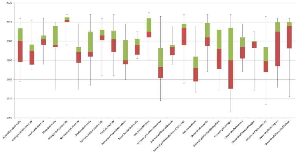
The following chart helps show the distribution of faculty placement that I described here.
Here’s a recap of the data and how it was collected.
- I recorded the names of faculty associated with a rhetoric and composition program from each school listed as a member of the Consortium of Doctoral Programs in Rhetoric and Composition.
- I identified each faculty member PhD alma mater and year of graduation.
- I created a dataset that associated feeder institutions to the doctoral consortium schools.
The idea was to identify “invisible colleges” that are generating faculty for schools that train the rhetoric & composition instructors in the United States. The institutions identified would theoretically (as in invisible college theoretically) be institutionally powerful for distributing the disciplinary knowledge of rhetoric and composition.
There are a few drawbacks to this approach. One, the Doctoral Consortium is a self-selecting group. The bar for entry is pretty low I think. I believe a program simply needs to contact the consortium and ask to be listed. Alternatively, it’s possible that an influential rhetoric & composition program never identified itself for inclusion. It seems like the University of Kentucky would probably have PhD program for rhetcomp, but it’s not listed, and the hell if I was going to try to locate every possible program in the United States that has a PhD program marginally related to rhetcomp. In those case, those schools would have been left out of my data.
Another drawback: I gathered faculty data from webpages. Most of these programs are components of English departments. Identifying which faculty were part of the rhetoric & composition faculty was sometimes difficult. This is especially true since programs often make their programs look stronger than they are by including faculty that are marginal to the program. I could give examples of this, but if you’re reading this you’re probably associated with a rhetcomp program and can name the faculty listed that are not really involved with your program. I erred on the side of selecting too many rather than too few. If a program listed faculty as interested in rhetcomp, that person became a data point.
My first post listed the schools placing the most faculty members. Below is a chart that shows the temporal spread of the top 23 schools placing faculty (click here to see it big). The highest placing school was Purdue with 39 placements. The cutoff for selecting these programs was at least 8 placements.

This is a simple box plot of the data. Each column represents a school and the years that school was graduating students who ended up as Doctoral Consortium faculty. The bottom box is the first quartile to the median. The line in the middle is the median of the data. The top box is the median to the third quartile of the data. The whiskers represent the first graduate and the last graduate.
So for example, the first column is Arizona State University (eight Doctoral Consortium faculty graduated from ASU). The first faculty member graduated in 1979 (the bottom whisker). The last graduated in 2012 (the top whisker). The median graduation date of ASU faculty was 2000. The median of the graduates pre-2000 was 1989. The median of the graduates post-2000 was 2006.
This basic plot highlights when programs were most actively graduating faculty for the consortium. There are a few interesting schools worth pointing out. First, Michigan State has been more actively placing faculty in recent years. So have the University of Arizona and the University of Washington. Second, it looks like Rensselaer, UC-Berkeley, and the University of Iowa were more active before 2000.
In this case “more actively” means that the dates of graduates were proportionally higher. Keep in mind when you look at this chart that the range of placement for a school is from 39 to 8. You can’t say that placement rates were necessarily higher, simply that the graduates were more likely to come from the time periods highlighted in the chart. This chart doesn’t represent the placement of Purdue or the University of Texas at Austin particularly well because of how many graduates come from those two schools.
But, this does highlight interesting trends that people familiar with the school might be better able to talk about. For instance, the University of Texas at Arlington has a tiny time frame where they graduated several people that ended up in the Doctoral Consortium. These students were most frequently advised by Victor Vitanza, and when he moved to Clemson, Arlington stopped graduating as many students into Doctoral Consortium schools. If this were baseball, I suppose that would qualify Vitanza as a franchise player. The fact that Clemson only has Doctoral Consortium faculty after Vitanza arrived seems to suggest that. I’m sure there are other stories that help explain the institutionality of this data. I’d love to start collecting stories that help explain the weird points.
One thought on “Invisible Colleges in Rhetoric and Composition, Part II”